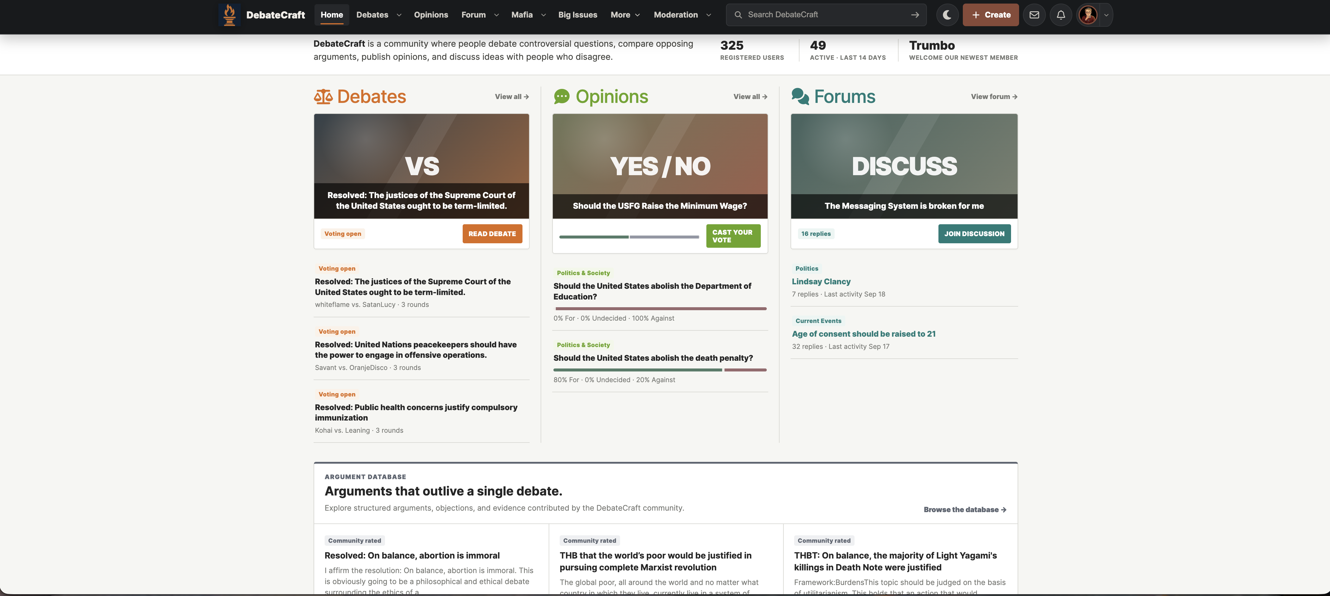
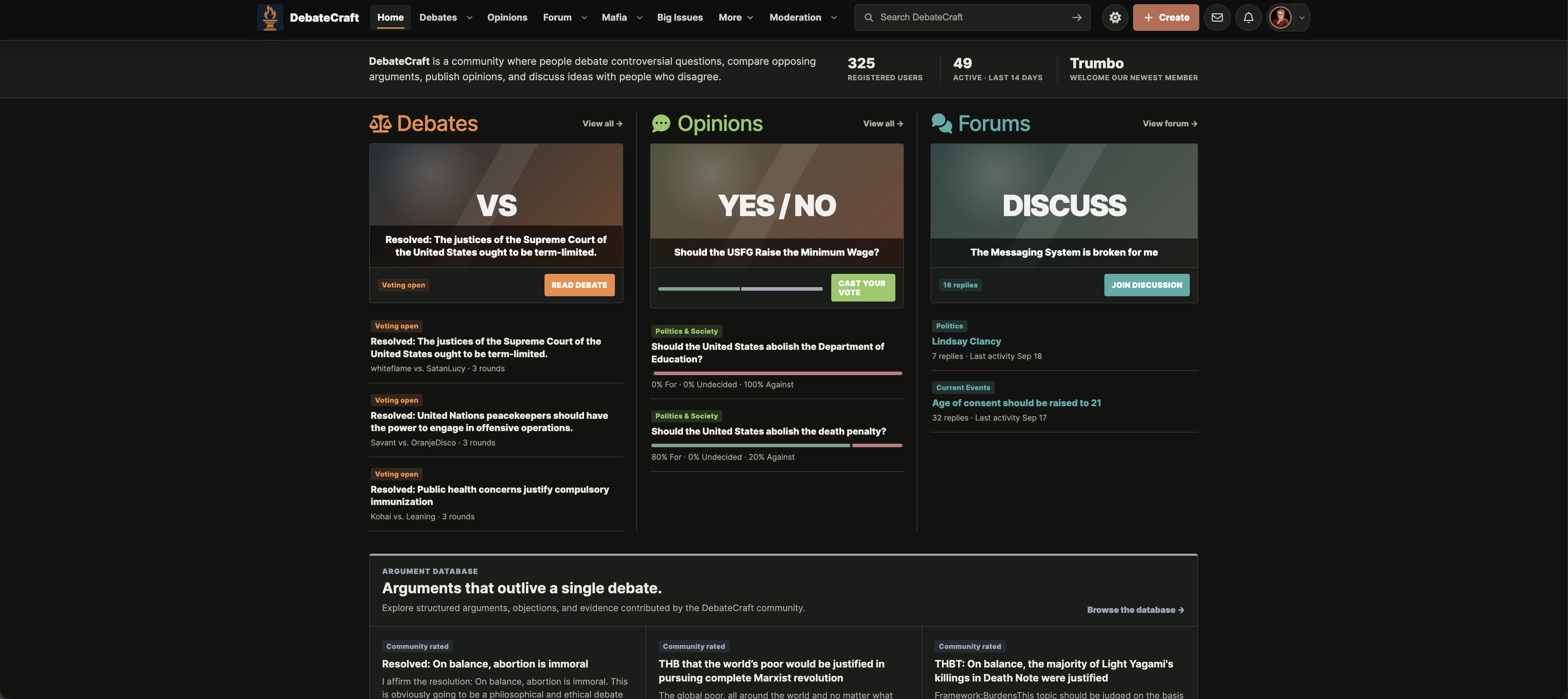
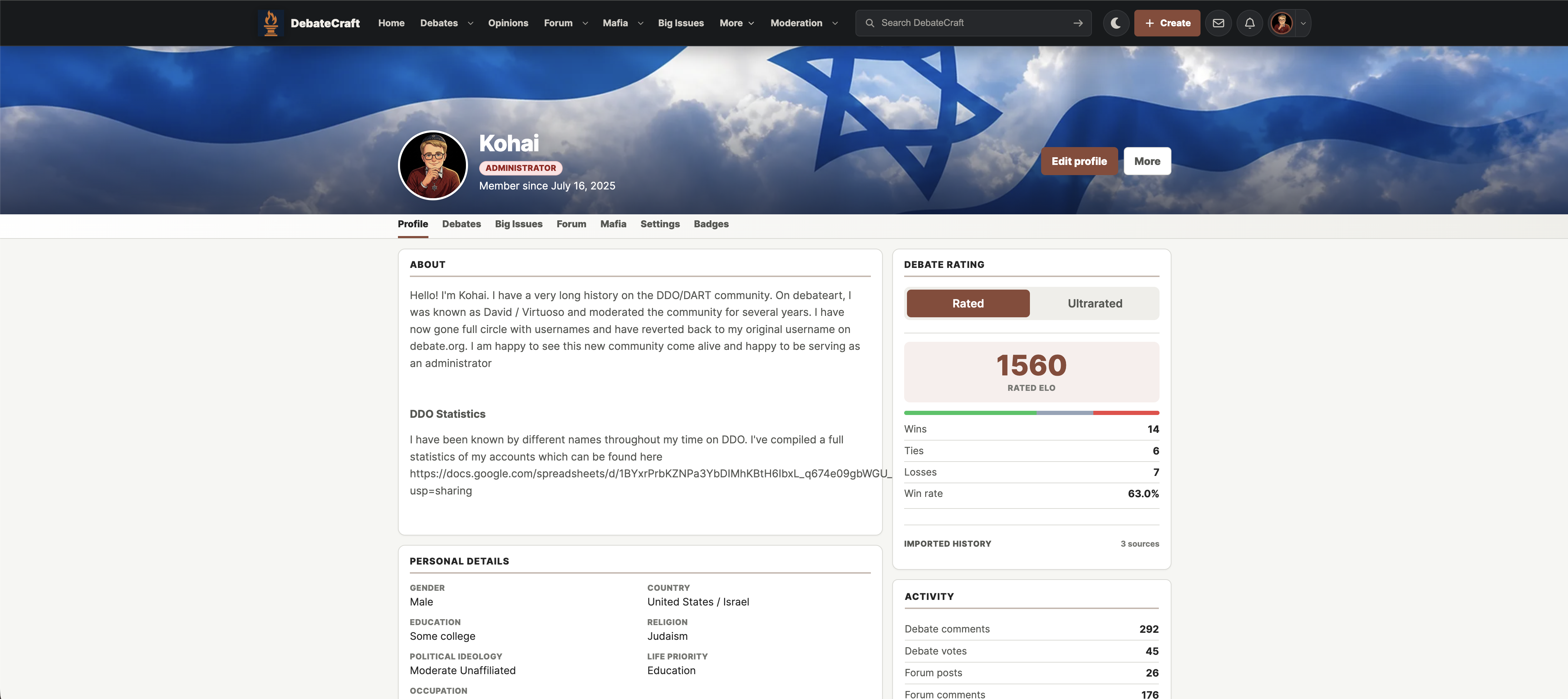
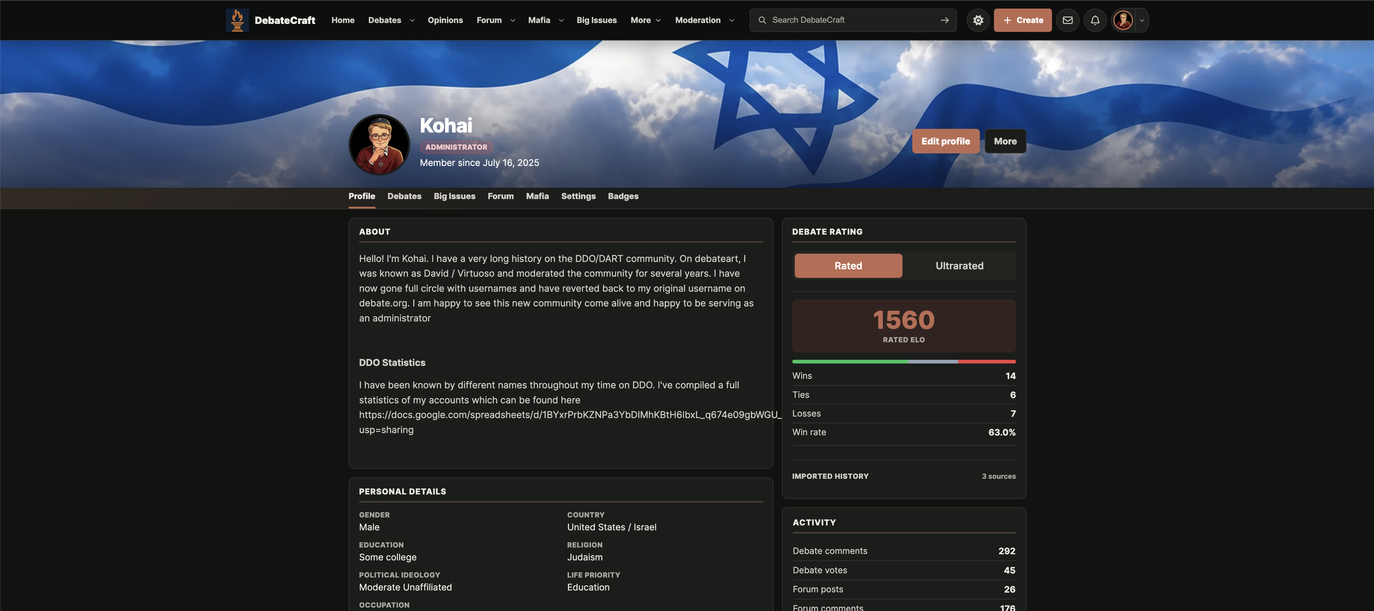
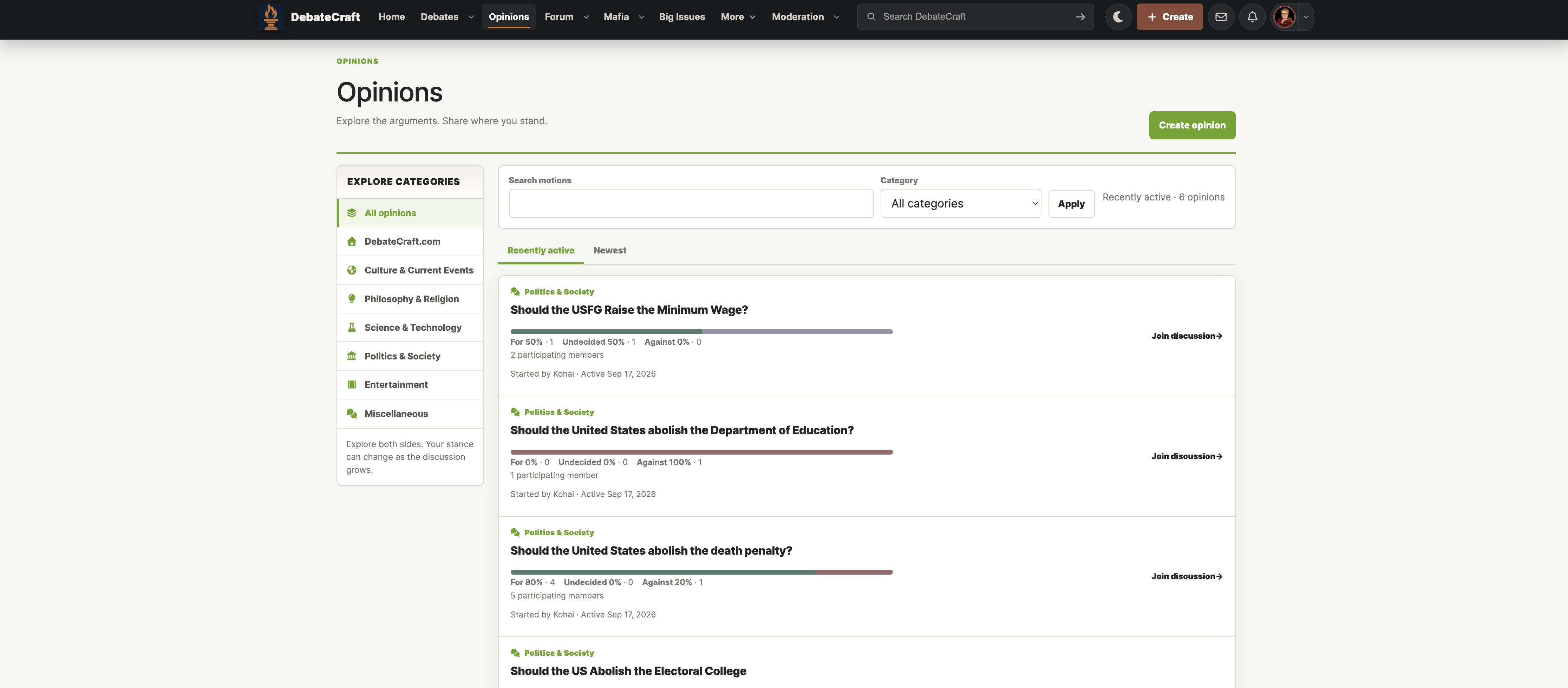
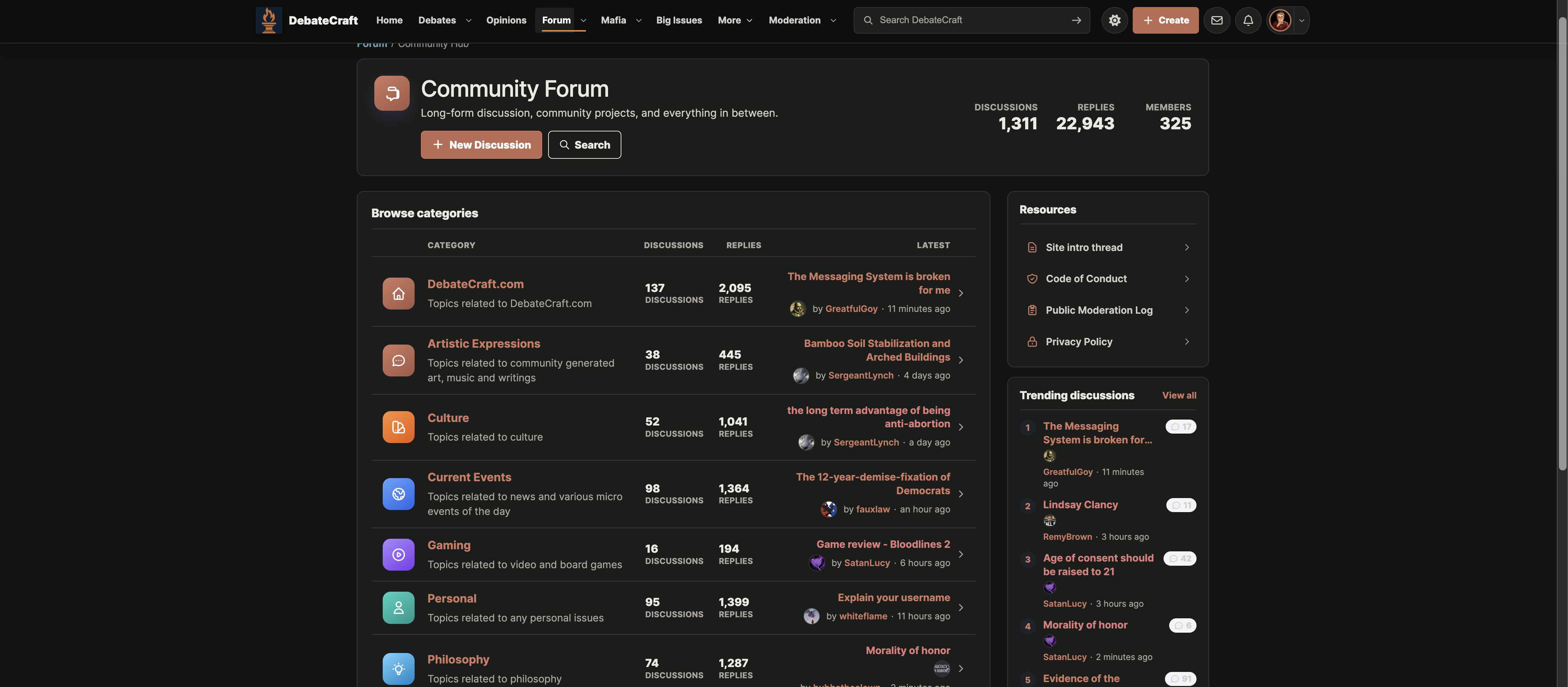
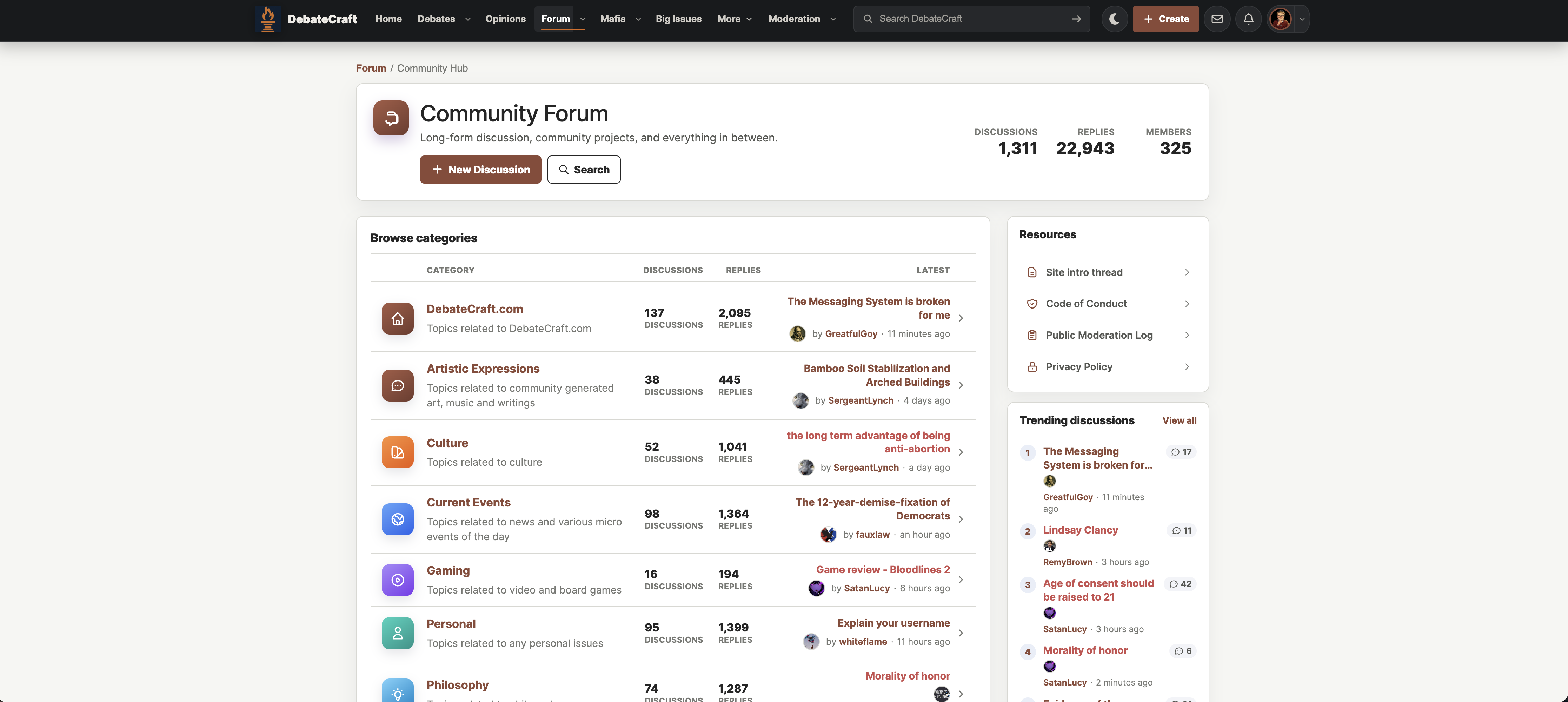
You are describing the 60-30-10 color rule, a classic design principle originally from interior design that has become a fundamental concept in UI/UX design, web layout, and graphic composition.
This rule creates an intentional visual hierarchy, ensuring that the screen does not look chaotic or overwhelm the user's eyes.
The Color Breakdown
60% Dominant Color Canvas base, large surface areas, and overall background. Usually a neutral or muted tone (white, light gray, dark mode black).
30% Secondary Color Sidebars, navigation bars, content cards, and text blocks. It adds structural contrast and supports the main theme.
10% Accent Color Actionable elements like Call-to-Action (CTA) buttons, notifications, and important badges. It is usually a vibrant, highly contrasting hue meant to guide the user's attention.
Why This Rule Works
* Focal points: The human brain naturally spots anomalies. Because the accent color is restricted to just 10% of the canvas, it acts as a magnet for the user's gaze.
* Readability: It prevents competing elements from causing visual fatigue.
* Branding: It ensures your primary brand color stands out instead of getting lost in a muddy palette.
Real-World Examples
* Spotify: 60% Black (background canvas), 30% Dark Gray (cards, side bars), and 10% Neon Green (play buttons, active states).
* Google Material Design: 60% White (clean background workspace), 30% Muted Gray (search bars, functional sections), and 10% Blue (active icons and primary links). [7, 8]
If you are currently working on a specific layout, let me know:
* What kind of product you are designing (e.g., e-commerce, portfolio, SaaS)
* Your primary brand color
* Whether you are targeting a light or dark interface